







In the fast-moving world of social media, few symbols capture attention and energy quite like the TikTok logo. From its roots in a Chinese short-video app to becoming a global cultural phenomenon, the TikTok logo embodies creativity, music, and viral motion. Understanding its history reveals how thoughtful design helped propel the platform from niche beginnings to billions of users worldwide.
This deep dive into TikTok logo history and design evolution explores its origins, key changes, symbolism, and why it remains so effective. Whether you’re a creator using TikTok login, shopping via TikTok Shop, or exploring tools like TikTok video downloader or TikTok coins and TikTok recharge, the logo is the visual anchor tying it all together.
The Origins: From Douyin to Global TikTok
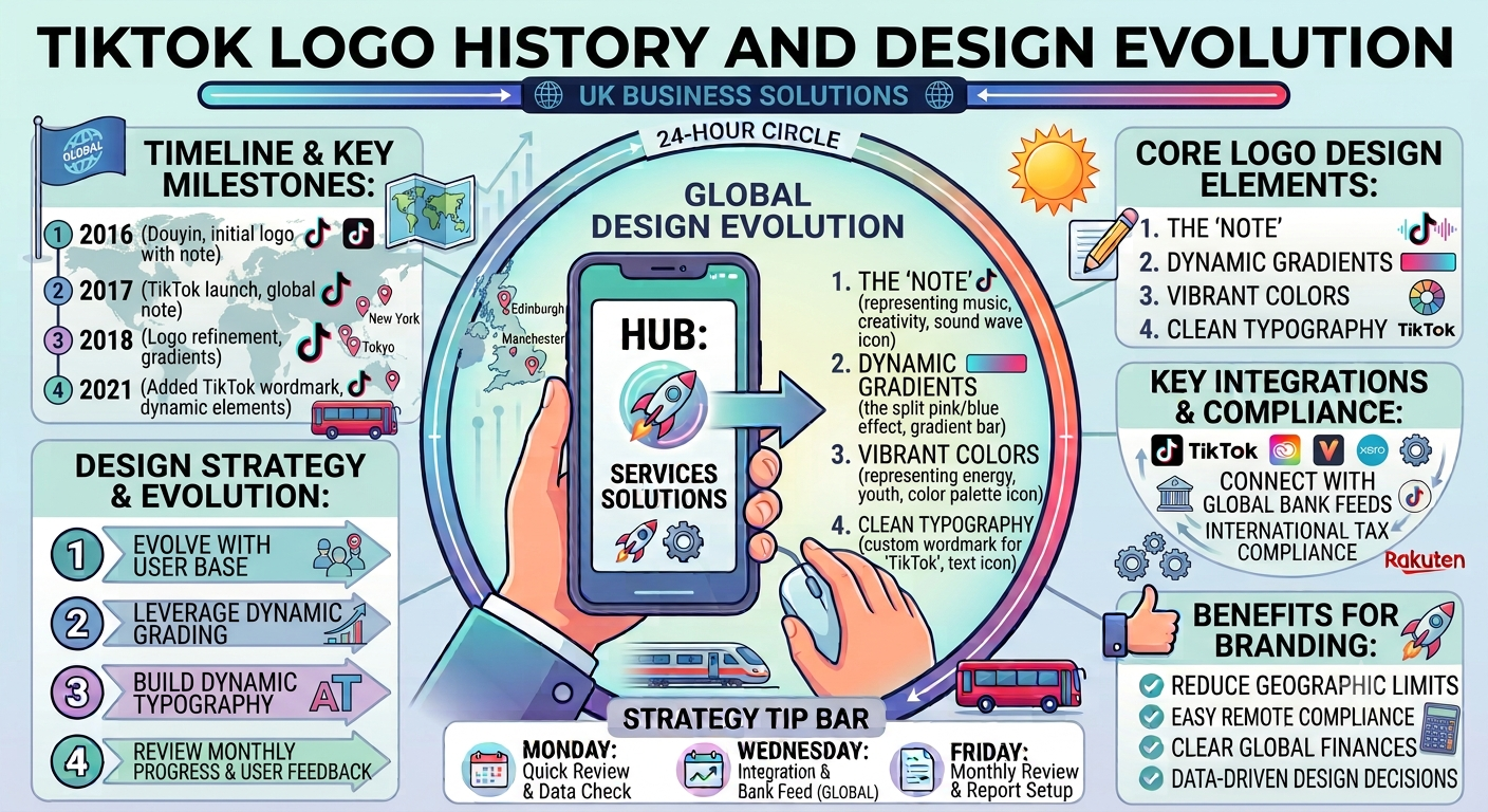
The story of the TikTok logo begins in 2016 with ByteDance’s launch of Douyin (抖音), meaning “shaking sound” or “vibrating music,” in China. Early versions appeared under the brief name A.me before settling on Douyin. The core icon a stylized musical note shaped like a lowercase “d” was already present, nodding directly to the Chinese name while evoking music and rhythm.
This musical note wasn’t arbitrary. It symbolized the app’s focus on short, sound-driven videos. The design featured vibrant, neon-like colors (cyan, fuchsia, pink) with a 3D or chromatic aberration effect, suggesting energy and movement like sound waves pulsing on a stage.
When ByteDance expanded internationally in 2017, it launched TikTok as a separate app (later merging with Musical.ly in 2018). Remarkably, the core logo element carried over with minimal changes, providing instant continuity across markets. This decision proved smart: the universal musical symbol transcended language barriers.
Early Iterations: 2016–2018
2016 (Douyin/A.me Era): The initial logo emphasized the musical note icon with a black or simple background. Wordmarks were minimal or absent in the earliest phases. The “d”-shaped note had a dynamic, layered appearance for depth.
2017–2018 (Global Launch): As TikTok gained traction outside China, the wordmark “Tik Tok” (two words) was added below or beside the icon in a clean sans-serif font. Colors remained bold, with the note often in black against vibrant accents. This period aligned with rapid user growth and the Musical.ly integration, which brought lip-sync and duet features into the mainstream.
During this time, the logo helped establish TikTok as fun, youthful, and music-centric, differentiating it from static social platforms.
The 2018 Refinement: The Iconic Modern Design
The most significant evolution came in 2018. ByteDance (with contributions reportedly involving agencies like Wolff Olins for refinements) unified the branding. Key changes included:
- Combining “Tik” and “Tok” into one word: TikTok.
- Refining typography: Heavier, more connected letters with subtle modifications (e.g., rounded “i” dot, adjusted “T” crossbars).
- Adding color accents to the “o” in “Tok,” often with cyan and fuchsia shadows mirroring the note’s vibrancy.
- Maintaining the “d”-shaped musical note as the central emblem, sometimes with slight smoothing for better scalability across devices.
This version struck a perfect balance: playful yet professional, energetic without being chaotic. The black note on varied backgrounds (including white or gradient versions) ensured versatility for app icons, merchandise, and marketing.
Since 2018, the logo has seen only minor tweaks for resolution, alignment, and digital optimization no major overhauls. This consistency has been key to building instant recognition. A 2025 secondary variant was noted in some branding updates, but the core design endures.
Symbolism and Design Elements: Why It Works
The TikTok logo succeeds through deliberate choices:
- The Musical Note “d”: Represents Douyin heritage, music, and “shaking” vibration. It visually pulses with energy, evoking creativity and short-form content.
- Colors: Cyan, fuchsia, black, and accents create a vibrant, youthful palette. The chromatic effect suggests motion and digital glitch perfect for video.
- Typography: Custom sans-serif (refinements from bases like Sofia Pro) is bold, readable, and modern. The single-word treatment flows rhythmically.
- Overall Aesthetic: Minimalist yet dynamic. It scales well from tiny app icons to large billboards and feels approachable for Gen Z and beyond.
These elements align perfectly with TikTok‘s identity as a platform for authentic, music-driven expression. Features like TikTok Shop and creator tools build on this energetic foundation.
Comparison Table: TikTok Logo Evolution
| Period | Key Features | Wordmark | Colors & Effects | Significance |
|---|---|---|---|---|
| 2016 (Douyin) | Stylized “d” musical note | Minimal/A.me | Neon cyan/fuchsia, 3D layers | Chinese origins, music focus |
| 2017–2018 | Note + emerging wordmark | “Tik Tok” (two words) | Black note, vibrant accents | Global launch & Musical.ly merge |
| 2018–Present | Refined note, unified branding | “TikTok” (one word) | Cyan/fuchsia on “o”, clean black | Iconic global recognition |
This table highlights the thoughtful progression from experimental to enduring.
The Role of the Logo in TikTok’s Growth
The logo’s stability amid explosive growth (from viral challenges to e-commerce via TikTok Shop) is notable. While competitors refreshed identities, TikTok’s consistency reinforced trust and memorability. It appears everywhere from profile icons during TikTok login to promotional materials.
For users engaging with TikTok download, TikTok video downloader, or TikTok coins and recharge features, the logo signals the official, vibrant ecosystem. Its design evolution mirrors the app’s shift from music-focused to a full entertainment and commerce hub.
Deep insight: In a world of constant rebrands, TikTok proves that a strong, culturally resonant core symbol tied to its “Douyin” roots can transcend borders without dilution. The logo doesn’t just identify; it invites participation in a cultural movement.
Design Lessons from TikTok
- Simplicity with Energy: Complex enough to feel dynamic, simple enough for universal appeal.
- Cultural Sensitivity: Retaining Chinese heritage while going global.
- Scalability: Works in monochrome or full color across devices.
- Consistency: Minor refinements over radical changes build equity.
Brands can learn that authenticity and emotional connection often outperform frequent redesigns.
FAQ: Common Questions About the TikTok Logo
What does the TikTok logo represent?
The stylized musical note shaped like a “d” symbolizes music, vibration (from Douyin), and creative expression central to the platform.
Has the TikTok logo changed much?
Core elements have remained consistent since 2018, with only subtle typography and color refinements for better usability.
Why is the TikTok logo so recognizable?
Its vibrant colors, dynamic note shape, and rhythmic wordmark capture the app’s energetic, music-driven essence perfectly.
Can I download the official TikTok logo?
Official assets are available through TikTok’s brand resources for approved partners. Fan or promotional use should respect guidelines.
How does the logo tie into features like TikTok Shop?
The consistent branding unifies the experience across video, shopping, and creator tools, building trust.
What inspired the musical note design?
It originated with Douyin’s focus on sound and “shaking” music, evolving into a global symbol of short-form creativity.
Is there a difference between Douyin and TikTok logos?
They share the core note icon, but TikTok’s includes the English wordmark tailored for international audiences.
Conclusion: A Logo That Moves with Culture
The TikTok logo history and design evolution showcases how a simple yet powerful symbol can fuel a platform’s rise to global dominance. From its 2016 Douyin roots to today’s refined icon, it has adapted just enough to stay relevant while preserving its vibrant, musical heart.