






In today’s digital landscape, where over half of global web traffic comes from mobile devices, ensuring your website works seamlessly on smartphones and tablets is no longer optional—it’s essential. A non-responsive site frustrates users, hurts search rankings, and leads to higher bounce rates. Google’s mobile-first indexing means the mobile version of your site is what primarily determines your SEO performance.
Learning how to make a website mobile friendly HTML gives you full control over the user experience. Whether you’re building from scratch or improving an existing site, this guide covers practical, up-to-date techniques using HTML, CSS, and best practices that deliver fast, intuitive mobile experiences in 2026 and beyond.
Why Mobile-Friendliness Matters More Than Ever
Mobile users expect quick loading, easy navigation, and readable content without excessive zooming or horizontal scrolling. Poor mobile experiences directly impact conversions, engagement, and SEO. Sites that aren’t mobile-friendly risk lower visibility in search results because Google prioritizes responsive designs.
How to make a website mobile friendly starts with understanding core principles: responsive web design, performance optimization, and touch-friendly interfaces. These elements ensure your site adapts gracefully across devices, from small phones to large tablets.
The Foundation: Viewport Meta Tag in HTML
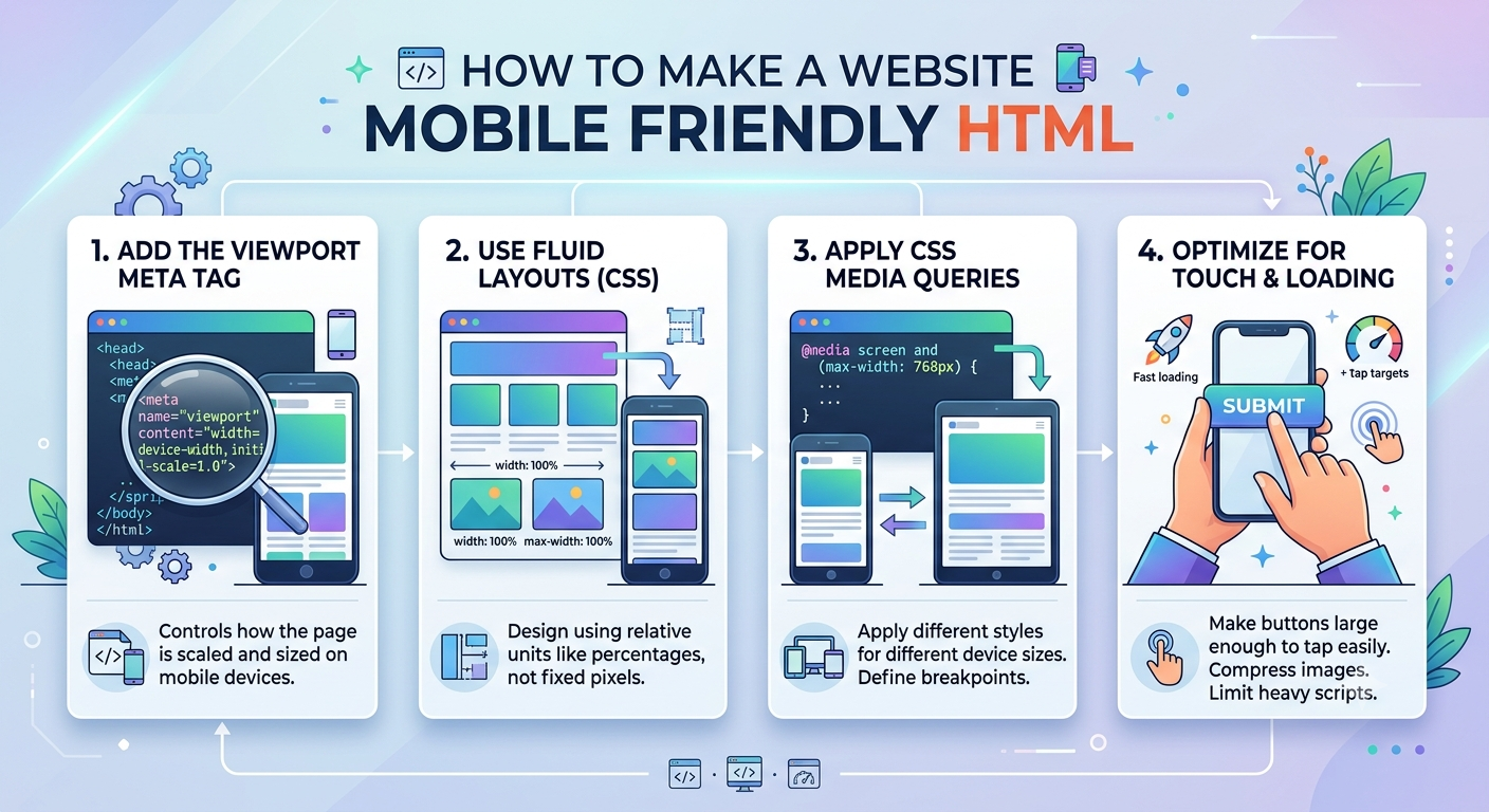
The single most important step in how to make HTML mobile friendly is adding the viewport meta tag. Without it, mobile browsers assume a desktop viewport (often around 980px) and scale down the page, resulting in tiny text and unusable layouts.
Add this to the <head> section of your HTML:
HTML
<meta name="viewport" content="width=device-width, initial-scale=1.0">- width=device-width: Sets the page width to the device’s screen width.
- initial-scale=1.0: Displays the page at 100% zoom.
This simple tag enables responsive CSS rules to work correctly. For stricter control, you can add maximum-scale=1.0 or user-scalable=no, but use these sparingly as they can harm accessibility.
Responsive Web Design Basics
Responsive design uses HTML and CSS to make layouts adapt to different screen sizes. It relies on fluid grids, flexible images, and CSS media queries rather than fixed pixel widths.
Using CSS Media Queries
Media queries are the backbone of responsiveness. They apply styles based on device characteristics like width, height, or orientation.
CSS
/* Mobile-first approach */
body {
  font-size: 16px;
  padding: 1rem;
}

/* Larger screens */
@media (min-width: 768px) {
  .container {
    max-width: 1200px;
    margin: 0 auto;
  }
}
Mobile-first design starts with base styles for small screens and progressively enhances for larger ones. This approach is efficient and aligns with modern development trends.
Flexible Layouts with Flexbox and Grid
Modern CSS makes responsive layouts straightforward:
- Flexbox: Great for one-dimensional layouts like navigation bars.
- CSS Grid: Ideal for complex two-dimensional layouts.
Example of a responsive navigation:
CSS
.nav {
  display: flex;
  flex-direction: column; /* Stacks on mobile */
  gap: 1rem;
}

@media (min-width: 640px) {
  .nav {
    flex-direction: row;
    justify-content: space-between;
  }
}
These tools allow content to reflow naturally without breaking.
Making Images and Media Responsive
Large, unoptimized images are a major cause of slow mobile loading. Use responsive image techniques:
HTML
<img
  src="image.jpg"
  srcset="image-400.jpg 400w, image-800.jpg 800w, image-1200.jpg 1200w"
  sizes="(max-width: 600px) 100vw, 50vw"
  alt="Descriptive text"
loading="lazy">- srcset: Provides multiple image sources.
- sizes: Tells the browser which image to use based on viewport.
- loading=”lazy”: Defers offscreen images.
Compress images with modern formats like WebP or AVIF and serve appropriately sized versions. This dramatically improves load times on mobile networks.
Typography and Touch-Friendly Design
Mobile users read on smaller screens, often in bright light or while moving. Key tips:
- Set a base font size of at least 16px to prevent auto-zoom on iOS.
- Use relative units (rem, em, or clamp()) for fluid typography.
- Ensure touch targets are at least 44×44 pixels (Apple recommendation) or 48×48 pixels.
- Maintain line lengths of 45–75 characters for readability.
- Simplify navigation with hamburger menus on small screens.
Avoid fixed positioning that can obscure content on mobile. Test interactive elements like buttons and forms thoroughly.
Performance Optimization for Mobile
Speed is critical. Mobile users on slower connections abandon slow sites quickly.
- Minify HTML, CSS, and JavaScript.
- Enable browser caching.
- Use CDNs for assets.
- Implement lazy loading and code splitting where applicable.
- Prioritize above-the-fold content.
Tools like Google PageSpeed Insights help identify bottlenecks specific to mobile.
How to Convert a Website to Mobile-Friendly
For existing sites, follow this step-by-step process:
- Add the viewport meta tag.
- Audit current layout with browser dev tools (toggle device emulation).
- Implement fluid grids and relative units.
- Add media queries for breakpoints (common ones: 480px, 768px, 1024px—but test content-driven breaks).
- Optimize images and fonts.
- Test on real devices and emulators.
Can you make an HTML website on mobile?
Yes, though it’s challenging for complex coding. Use mobile code editors or progressive web app (PWA) capabilities for a more app-like feel.
How to make a website suitable for mobile phones?
Focus on vertical scrolling, thumb-friendly navigation, and minimal cognitive load.
Can I scale a webpage to make it mobile-friendly?
Scaling alone (via viewport) isn’t enough; true responsiveness requires layout adjustments.
Comparison of Responsive Techniques
| Technique | Best For | Pros | Cons | Example Use Case |
|---|---|---|---|---|
| Media Queries | Breakpoint-specific styles | Precise control | Can become complex | Navigation changes |
| Flexbox | 1D layouts | Easy alignment | Less ideal for 2D grids | Card layouts, nav bars |
| CSS Grid | 2D complex layouts | Powerful, intuitive | Steeper learning curve | Main content areas |
| Viewport Meta | Initial scaling | Essential foundation | None if used correctly | All responsive sites |
| Responsive Images | Media optimization | Saves bandwidth | Requires multiple assets | Hero images, galleries |
This table highlights when to apply each method for efficient how to make a website mobile friendly HTML implementation.
How to Make a Website Mobile Friendly WordPress
WordPress users have additional options. Most modern themes (like those on WordPress.com) are already responsive.
- Choose or switch to a responsive theme.
- Use the Customizer to adjust mobile-specific settings (fonts, menus, layouts).
- Install plugins like WPtouch for dedicated mobile themes if needed, though responsive design is generally preferred.
- Edit CSS via Appearance > Customize > Additional CSS for custom tweaks.
- Use the Block Editor to ensure content stacks properly on mobile.
Test with WordPress’s built-in preview and real devices. Plugins for image optimization (e.g., Smush) and caching further enhance mobile performance.
Testing Your Mobile-Friendly Website
How mobile friendly is my website? Use these tools:
- Google’s Mobile-Friendly Test (or its successors like Lighthouse in Chrome DevTools).
- Browser developer tools (Chrome, Firefox, Safari) with device emulation.
- Real device testing on platforms like BrowserStack.
- Lighthouse audits for performance, accessibility, and SEO.
Regular testing catches issues like overlapping elements or slow load times early.
Common Challenges and Solutions
- Horizontal scrolling: Fix with overflow-x: hidden or proper container widths (use percentages/max-width).
- Tiny text: Enforce minimum font sizes and line heights.
- Slow loading: Prioritize critical CSS and defer non-essential scripts.
- Navigation issues: Implement accessible hamburger menus with ARIA attributes.
- Form usability: Use larger inputs and appropriate type attributes (e.g., tel, email).
Semantic HTML (proper headings, landmarks) improves both accessibility and SEO.
FAQ: How to Make a Website Mobile Friendly HTML
1. What is the most important HTML tag for mobile friendliness?
The viewport meta tag is foundational. Without it, responsive designs won’t function properly on mobile browsers.
2. How to make a website mobile friendly WordPress without coding?
Select a responsive theme, use the Customizer for adjustments, and optimize images/plugins. Most themes handle the basics automatically.
3. Can scaling a webpage make it mobile-friendly?
Basic scaling helps but is insufficient. Combine viewport settings with responsive CSS for proper adaptation.
4. How do I test if my HTML site is mobile-friendly?
Use Google Lighthouse, browser dev tools, and real devices. Aim for passing mobile usability scores.
5. What’s the difference between mobile-friendly and responsive design?
Mobile-friendly ensures basic usability; responsive design provides an optimized, adaptive experience across all screen sizes.
6. How to convert a non-responsive website to mobile-friendly?
Start with the viewport tag, refactor layouts to use relative units and media queries, then optimize content and media.
7. Does mobile-first design improve SEO?
Yes. It aligns with Google’s mobile-first indexing and provides better user signals like lower bounce rates.
Conclusion
Mastering how to make a website mobile friendly HTML empowers you to create inclusive, high-performing websites that thrive in a mobile-first world. By implementing the viewport meta tag, leveraging modern CSS like Flexbox and Grid, optimizing assets, and rigorously testing, you’ll deliver excellent experiences that boost engagement and search visibility.